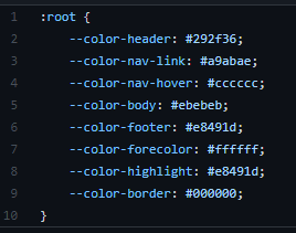
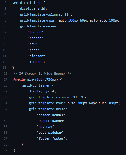
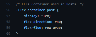
Posted on March 24, 2021December 25, 2021 by sameerBlog Website A responsive blog website which uses CSS Grid and Flexbox to re-arrange components. Viewed on a laptop When viewed on a device. GitHub Link Live Demo Skills: Basic HTML and CSS StructuresCSS GridsFlex Box Code Highlights: Used CSS variables to store colours Used CSS Grid and Media queries to make site responsive. Used Flexbox for the Posts – make the site responsive. Added hovering effect to the boxes.